
Responsiveness of the 2024 Congressional Districts
The following analysis considers how responsive the current US Congressional maps are to changes in public opinion. A district is responsive if it is seen to switch control from one party to another depending on the election. We contrast the number of seats which are responsive in the current US Congressional maps and a collection of non-partisan maps produced by the ALARM team at Harvard and published in Nature.
Some districts don’t change party due to the natural distribution of voters: For example, the at-large district in Wyoming is unlikely to go Blue, and neither is the district in western North Carolina. However, districts may also be intentionally designed to be non-responsive either due to incumbents insisting that they preserve their base or due to partisan gerrymandering.
The two scenarios can be distinguished by considering a collection of nonpartisan maps designed to uphold basic redistricting criteria and seeing how many districts those maps typically have that respond to plausible fluctuations in voting patterns.
In the this work we consider two collections (or ensembles) of maps. The first considers the basic non-partisan maps listed above. The second selects the 25% most responsive maps in the first ensemble. The first ensemble plausibly describes the character of maps that might be drawn if no attention was paid to partisan make-up or incumbent power. The second ensemble of maps plausibly represents the character of maps that a nonpartisan body might draw if it prioritized making the districts responsive to the changing will of the people.
The 2024 Congressional Elections will not Adequately Respond to the Will of the People
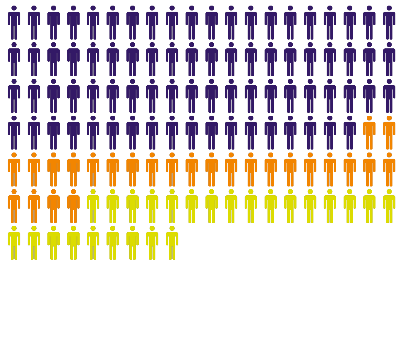
By cycling over a colection of plausible voting patterns we record how often each district switches party control. The graphic below shows how many seats meet different levels of responsiveness in the current maps, on average in the ensemble of non-partisen maps, and when the average is restricted to the top 25% of responsive maps in the ensemble. The dark purple people represent the number of responsive seats in the current map, while the orange people give the additional number of responsive seats typicaly gained in the in the collection of nonpartisan maps. The yellow people show the additional responsive seats gained in the ensemble of more responsive maps.
We consider four thresholds when deciding if a district is reported as responsive.
Rarely or more responsive : Seats that change party even if only in a very small fraction of plausible voting patterns.
Infrequently or more responsive : Seats that change party 10% or more of the time under plausible voting patterns.
Occasionally or more responsive : Seats that change party 20% or more of the time under plausible voting patterns.
Frequently responsive : Seats that change party 30% or more of the time under plausible voting patterns.
In addition to the tables below that list the total number of seats nationally, we also provide maps that show which states the additional seats are contained in. Further below, we list the seat information state-by-state.
In the current congressional district maps, there were 92 seats that changed party in at least one percent of the elections we examined. On average, in the ensemble we saw 152 such seats. When selecting responsive district plans in the ensemble, we saw 161 seats that changed party in at least one percent of the elections we examined.
This count includes both districts that flip rarely (in as few as 1% of the elections) and districts that flip in as many as 50% of the elections. For details on the ensemble and data see here; for details on how we measure responsiveness see here.
In the current congressional district maps, there were 78 seats that changed party in at least 10 percent of the elections we examined. On average, in the Ensemble we saw 104 such seats. When selecting responsive district plans in the ensemble, we saw 129 seats that changed party in at least 10 percent of the elections we examined.
This count includes both districts that flip infrequently (in as few as 10% of the elections) and districts that flip in as many as 50% of the elections. For details on the ensemble and data see here; for details on how we measure responsiveness see here.

In the current congressional district maps, there were 45 seats that changed party in at least 20 percent of the elections we examined. On average, in the Ensemble we saw 58 such seats. When selecting responsive district plans in the ensemble, we saw 88 seats that changed party in at least 20 percent of the elections we examined.
This count includes both districts that flip occassionaly (in as few as 20% of the elections) and districts that flip in as many as 50% of the elections. For details on the ensemble and data see here; for details on how we measure responsiveness see here.

In the current congressional district maps, there were 20 seats that changed party in at least 20 percent of the elections we examined. On average, in the Ensemble we saw 31 such seats. When selecting responsive district plans in the ensemble, we saw 54 seats that changed party in at least 20 percent of the elections we examined.
This count includes only districts that flip frequently (in as few as 30% of the elections) through districts that flip in up to 50% of the elections. For details on the ensemble and data see here; for details on how we measure responsiveness see here.
We plot the districts in each state that could potentially elect a candidate from a different party. The color scheme represents the fraction of the elections we see in which the minority party wins an election. The darker districts are essentially “toss-ups” that could go to either party depending on the year and national/local sentiment and the strength of the candidates.
The districts are colored from West to East, most to least responsive. There is no geographic information in them other than the correspondance to the state. For details on how responsiveness was determined see here.
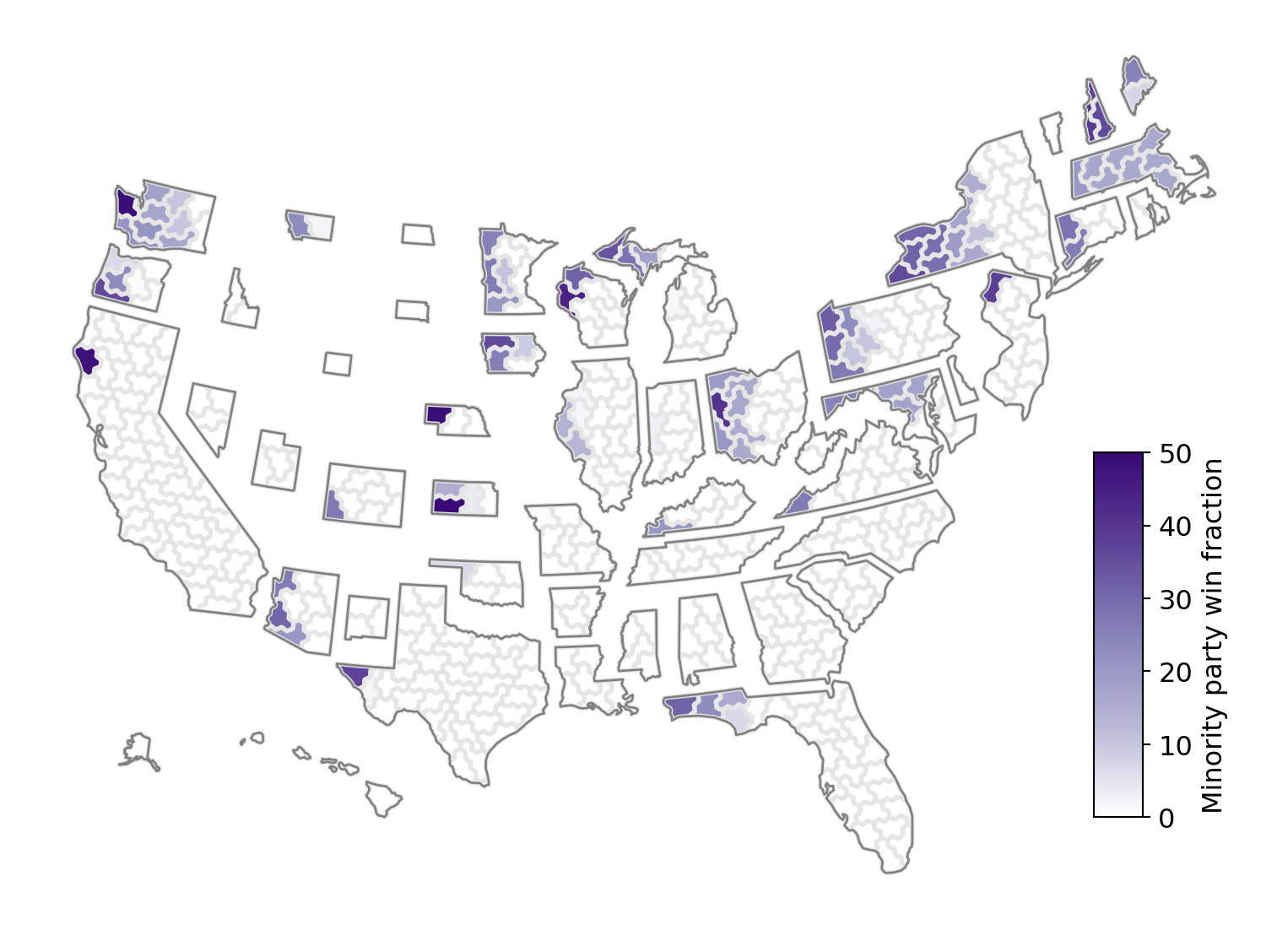


The first tab shows the current plan’s level of responsiveness. These maps are the ones that will be used in the 2024 congressional elections.
Considering a national collection of non-partisan congressional plans, the second tab shows the level of responsiveness over the collection of all plans. The figure shows the average of the responsive plans in each state.
Finally we repeat the analysis considering only the top quarter of the most responsive plans. The third tab shows the average of these more responsive plans in each state.
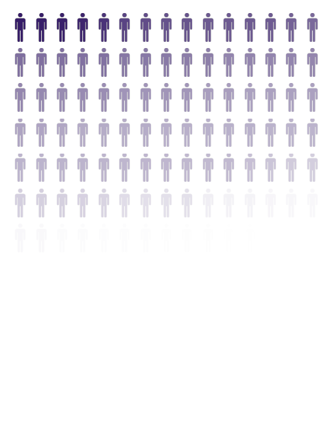
Seats Nationally Shaded by Responsiveness
The three plots below show the number of seats that exibit any level of responsiveness to changing electorial climates. The darkness of the purple person coresponds to the level of responsiveness with darker being more responsive.


Individual States
We now break down the above data state-by-state. We compare the current map with the average behavior under the more responsive maps. We list the seats gained in each of the four catagories described above: “Rarely or more responsive” (denoted Rately+), “Infrequently or more responsive” (demoted Infrequently+) “Occasionaly or more responsive” (denoted Occasionaly+), and “Frequently”.
| Current Map | State | Responsive Maps | Gain in: Rare+ | Infrequent+ | Occassional+ | Frequent |
|---|---|---|---|---|---|---|
 |
NY |  |
1 | 0 | 3 | 2 |
 |
TX |  |
8 | 7 | 5 | 3 |
 |
OH |  |
1 | 0 | 2 | 2 |
 |
PA |  |
1 | 1 | 1 | 1 |
 |
MA |  |
1 | 1 | 1 | 0 |
 |
WA |  |
1 | 1 | 1 | 0 |
 |
IL |  |
4 | 5 | 3 | 2 |
 |
FL |  |
3 | 3 | 3 | 2 |
 |
MI |  |
2 | 2 | 2 | 2 |
 |
AZ |  |
3 | 1 | 1 | 2 |
 |
MN |  |
2 | 0 | 0 | 2 |
 |
NC |  |
6 | 4 | 3 | 2 |
 |
WI |  |
2 | 1 | 0 | -1 |
 |
IN |  |
3 | 3 | 2 | 1 |
 |
MD |  |
1 | 0 | 1 | 1 |
 |
GA |  |
4 | 3 | 2 | 1 |
 |
OR |  |
2 | 1 | 1 | 1 |
 |
NJ |  |
2 | 1 | 0 | 0 |
 |
VA |  |
3 | 2 | 2 | 1 |
 |
CA |  |
2 | 1 | 1 | 0 |
 |
CT |  |
1 | 0 | 0 | 1 |
 |
IA |  |
0 | 0 | -1 | 0 |
 |
KS |  |
0 | 0 | 1 | 1 |
 |
SC |  |
3 | 2 | 2 | 1 |
 |
CO |  |
2 | 1 | 0 | 1 |
 |
MO |  |
3 | 2 | 1 | 1 |
 |
MT |  |
0 | 1 | -1 | 0 |
 |
KY |  |
0 | 0 | 0 | 0 |
 |
ME |  |
0 | 1 | 1 | 0 |
 |
NM |  |
1 | 1 | 1 | 1 |
 |
AL |  |
2 | 2 | 1 | 1 |
 |
NH |  |
0 | 0 | 0 | 0 |
 |
NV |  |
2 | 1 | 1 | 1 |
 |
AR |  |
1 | 1 | 1 | 0 |
 |
UT |  |
1 | 1 | 1 | 1 |
 |
OK |  |
0 | 1 | 1 | 1 |
 |
TN |  |
1 | 0 | 0 | 0 |
 |
NE |  |
0 | 0 | 0 | 0 |
 |
RI |  |
0 | 0 | 0 | 0 |
 |
WV |  |
0 | 0 | 0 | 0 |
 |
DE |  |
0 | 0 | 0 | 0 |
 |
WY |  |
0 | 0 | 0 | 0 |
 |
LA |  |
0 | 0 | 0 | 0 |
 |
ID |  |
0 | 0 | 0 | 0 |
 |
AK |  |
0 | 0 | 0 | 0 |
 |
MS |  |
0 | 0 | 0 | 0 |
 |
HI |  |
0 | 0 | 0 | 0 |
 |
VT |  |
0 | 0 | 0 | 0 |
 |
ND |  |
0 | 0 | 0 | 0 |
 |
SD |  |
0 | 0 | 0 | 0 |
How we Measured Responsiveness and Generated Election Voting Paterns
One must inquire into the possibility that, under different but plausible circumstances, a given district may elect a candidate with different policitical leanings. Additionally, the electorate may be responsive to messaging within a primary election but not a general election and vice versa. We do not intend these models to be perdictive of the next election, but rather give an indication of plausible spatial voting paterns baised on interpolating and extrapolation from past election data.
In this work, we focus only on general elections and on potential shifts in partisan leanings. We employ a series of models to probe reasonable election structures that are rooted in emperical historic election data. The results above are all presented around the cross-correlational perturbation method listed below with a noise of 0.1 (see here). In the remainder of this section we describe the series of voting models we have employed. Below we test for consistency across the models.
Model 1: Using Past Elections to Measure Responsiveness
As a baseline model, we examine a series of historic elections and compare the total number of Republican votes to the total number of Democratic votes in a given district. For each district, in each plan of the ensemble, we record the fraction of time the district leans toward the Democratic/Republican party according to the total number of votes cast for each party. According to this method, we would say that a district is “responsive” if it leans towards different parties in different elections. We take this as a first approximation to responsiveness.
Model 2: Cross-Correlational Perturbation (i.e. adding variation)
If a district is very close to flipping under one or several historic elections (say by only 100 votes), but we never actually observe it flip a majority vote share, the method above would report that the district is unresponsive.
We wish to determine some way of tracking “how close” a district is to flipping its partisan lean. Naively, this is some combination in the fluctuations around who shows up to vote and whether they are willing to vote across party lines. To obtain a measure of these fluctuations, we use the correlational data between turnout and partisan vote fraction across all pairs of precincts, by
- Constructing the matrix of election data where the rows correspond to each historic election, and the columns correspond to (i) the partisan vote share of each precinct and (ii) the turnout of each precinct (e.g. if we had 10 historic elections and 400 precincts, we would have a 10x800 dimensional matrix).
- Standardizing the column data by subtracting the mean and then renormalizing for unit deviation (this is the standard practice when performing PCA)
- Taking the SVD of this matrix, \(M=U\Sigma V'\)
And election, or row of \(M\), is then given as \(e_i \text{diag}(\sigma) + \mu\), where \(e_i = \sum_{j=1}^\ell U_{ij} \sigma_j V'_{j}\), \(V_{j}\) is the \(j\)th column of \(V\), and \(\mu\) and \(\sigma\) are the vectors of column-wise means and standard deviations, respectively, in the original matrix.
The advantage of taking the SVD is that the principal component, \(V_{1}\) describes the primary direction in which elections have been historically observed to fluctuate. This has a distinct advantage over more classical methods like uniform swing because it accounts for observations such as one precinct increasing its preference for a party differently than another. The collection of row vectors in \(U\) span a subspace of plausible election data. We may think of an election then as being represented by a unit vector that used to linearly combine the \(\sigma_j V'_{j}\)’s.
As a second method, we consider fluctuations in the voting data that correlate with historical elections by, first, selecting a random historical election and associated row vector, \(U_{i}\), and second, perturbing this vector randomly to \(U_{i}+\epsilon\) and then renormalizing this fluctuation. We consider Gaussian noise with standard deviations of 0.1 and 0.2. We remark that a deviation of 0 would result in the baseline method that we started with. In addition, we also consider what happens we we do not renormalize the perturbed \(u\) vector and find that it adds a modest amount of additional noise.
Model 3: Considering Redundancy Across Election Data
Although the method above accounts for plausible fluctuations, it does not account for “redundancy” in elections: For example suppose there was a single election in 2018, but 7 elections in 2020. Suppose also that the voting patterns in 2020 of the 7 elections were all very similar, but that the voting pattern in 2018 was very different. The method above might report that only 1 in 8 elections would lead to a change in partisan lean, whereas we may wish to determine that the 7 elections were essentially identical and really we only saw two voting patterns each leading to a different outcome. Contrarily, if the 7 elections all happened to split evely across the 50% line, then we might say that the district was very responsive (e.g. 4 out of 8 elections went to one party) whereas we may wish to put more weight on the 2018 election and conclude that 1.5 of every 2 elections would go to one party over the other.
To account for potential redundancies, we utilize the SVD to determine the relative similarities across elections. First, we consider the vectors formed by \(U\Sigma\). If the resulting vectors are similar in the important singular values then they will lead to similar election returns.
We weight elections via a bootstrapping technique: We begin by selecting a random election \(U_i \Sigma\), uniformly, and then project it off of all the elections. We use the magnitude of the remaining vector relative to the original magnitude as a weight to select the next election. When selecting an election we add the leftover weight to it’s overall weight. We repeat this until there are no more elections to choose from, and then repeat this entire process many times to establish a weight between elections.
Model 4: Mixing Turnout with Vote Fraction
To test the robustness of our results, we also consider a very different type of voting model: Each historic election has a turnout and partisan vote lean in each precinct. We can mix and match these across all pairs of elections to get an expanded voting model. This model suffers from a loss of correlation between turnout and partisan preference, however it does provide another method of examining differences across election patterns. If our results are robust across this voting pattern as well, it suggests our results are robust even with potential significant deviations between partisan preference and turnout.
Testing Robustness in Responsiveness Accross Voting Models
We have run several tests to check the robustness of our results and present one of them here. For each voting method, we look at the nationwide number of seats that elect the minority party at least 20% of the time in the current plan, and then examine the number of average and standard deviation in the additional number of seats gained when looking at the ensemble. As expected, we see that using historic data predicts the least responsive seats, however, the gains over the 5 models below are remarkably similar.
| Election Model | Responsive Seats in the Current Map | Additional Responsive Seats in the Ensemble | Additional Responsive Seats in More Responsive Ensemble |
|---|---|---|---|
| Historic Data | 34 | \(17.39 \pm 4.63\) | \(42.69 \pm 2.29\) |
| Mix Turnout and Partisan Lean | 38 | \(15.08 \pm 4.68\) | \(39.44 \pm 2.42\) |
| Cross-correlational perturbation (0.1) | 46 | \(14.40 \pm 4.79\) | \(39.48 \pm 2.61\) |
| Cross-correlational perturbation (0.2) | 49 | \(17.31 \pm 4.75\) | \(40.18 \pm 2.75\) |
| Cross-correlational perturbation (varient; 0.1) | 45 | \(16.94 \pm 4.85\) | \(40.88 \pm 2.66\) |
Data Sources
The data we used was sourced from this work, which contains an ensemble of non-partisan redistricting plans over all states. We manually sourced all states with a single at-large district and remark that we found that none of these were responsive. We are grateful to Kosuke Imai for producing this data and for fruitful conversations about it. We are also grateful for the help of Ranthony Clark for discussions around formulating parts of this report. This work is part of the Duke Quanftifying Gerrymandering Project.
Some of the enacted congressional plans have changed since Imai’s work was released, specifically, in AL, GA, LA, NC, and NY. The sources for the new files are linked. In each of them, we matched the precincts provided in ensemble dataset with the new districts and used these for updated plans.
The hexagonal maps were sourced from the DailyKos under the creative commons license
Code and Data
A repository with code and data
Revision History
- Iniitaly released Tuesday April 9th, 2024.